A low-energy summary of what's new (scroll down to read the full update):
What’s changed
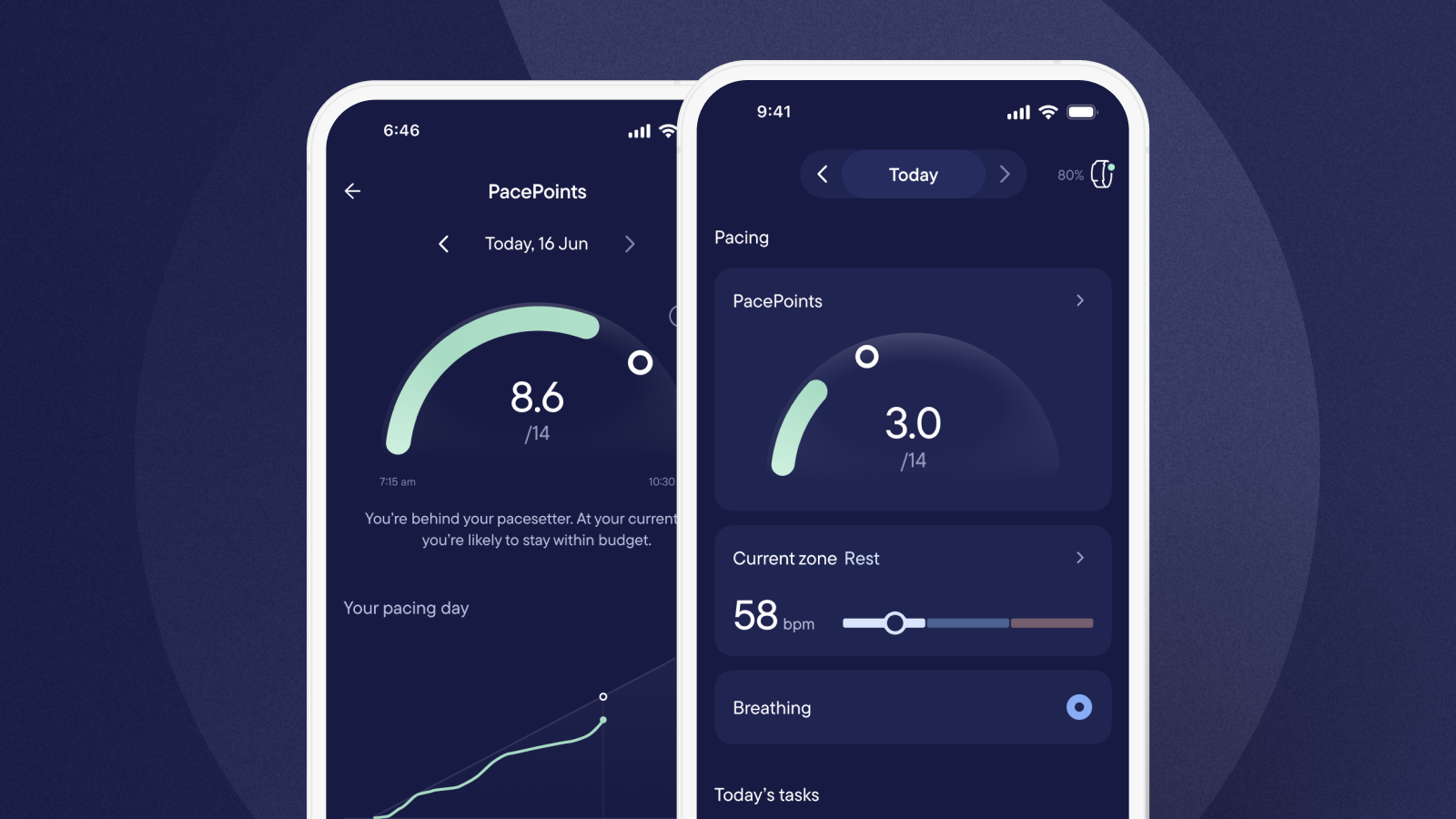
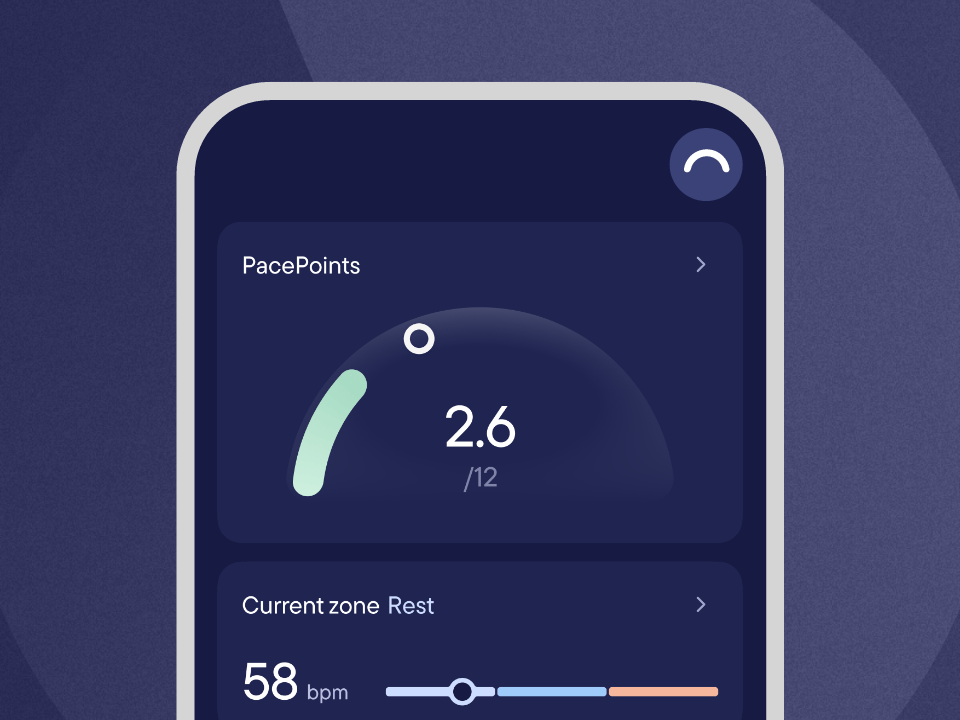
- PacePoints are now front and center as a colored arc that fills up through the day.
- Heart rate now sits just below as an easier to read line, with your current zone highlighted.
- New “Your pacing day” chart on the PacePoints page shows how PacePoints build over time.
What’s stayed the same
- Tap your heart rate to view your chart and tag activities as before.
- Everything else on the Today page is in the same place (coherent breathing, morning/evening/monthly check-ins).
Visible is here to help make pacing easier. We help you understand how your body is doing, so you don’t have to figure it out on your own.
This month, we’re improving how we do that with two updates: a refreshed Today page and a new pacing chart, designed for a clearer, more streamlined view of your pacing day. Both have been carefully tested and shaped with members before rolling out more widely.
The refreshed Today page
The new design is built on two principles: clarity and simplicity. PacePoints are now front and center, with heart rate shown just below.
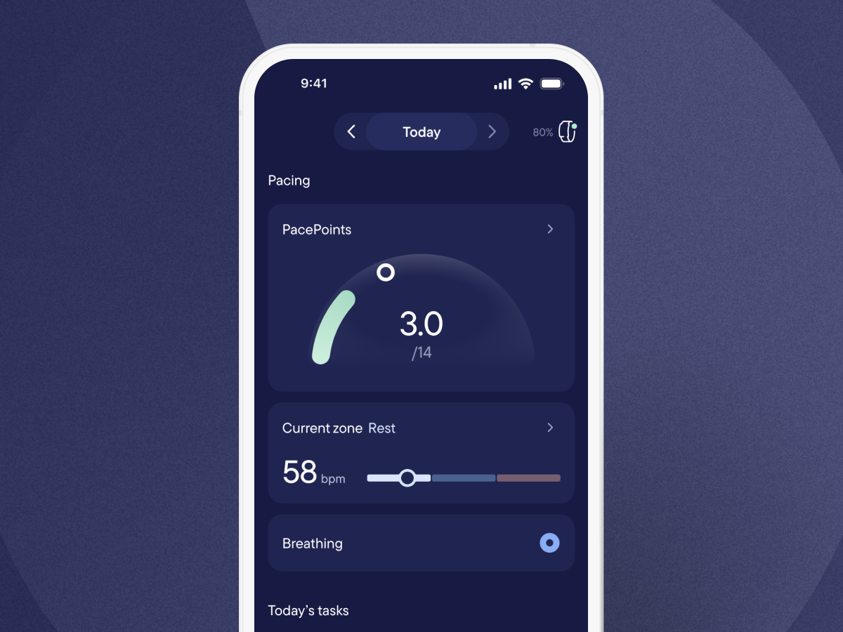
The colored arc fills up as you accumulate PacePoints throughout the day. The white circle is your PaceSetter, moving steadily across the arc to guide you in spreading your energy more evenly.
Heart rate is now shown as a line with colored zones. Your current zone is highlighted so it’s easier to check at a glance.
Together, these updates help you better understand your energy and make pacing decisions with more confidence.
A new way to look back on your day
We're also introducing “Your pacing day”, a new chart that shows how your PacePoints have built up across the day. You can find it on your PacePoints page (tap your PacePoints on the Today page).
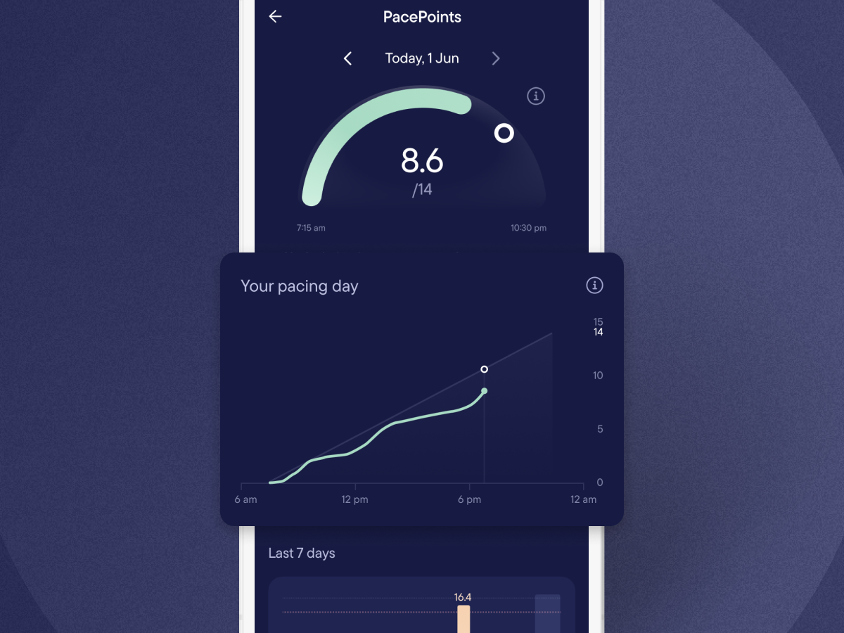
The diagonal line is your PaceSetter, showing what a steady day looks like. The thicker line shows how you’ve used your PacePoints so far that day. A steeper slope means a busier period, while a gentler slope means you've been taking it easier.
You can tap and hold anywhere on the chart to see your PacePoints total at any point in the day.
One member shared how the chart had supported better pacing decisions:
“This has stopped me from making a second trip on [the] same day to pick up more of my things, when I saw how far out from the target I was. Previously with only a numeric total to look at, I might have thought I could get away with it. With the chart it was obvious I was kidding myself!”
Built with you, every step of the way
Visible has always been built with the people who use it, and this update is no exception.
We shared early versions of the new Today page with a small group of members and improved it based on what you told us. We then rolled it out to 10% of members, gathering feedback and making further changes before landing on the final design.
Here's the type of thing you told us:
“On bad brain fog days, I don’t have the energy to interpret lots of information. This feels calmer and simpler. I can glance once and immediately understand where I am.”
“The arc for PacePoints makes more sense to me. It feels like the shape of a day. And it feels right that heart rate is shown as a line too. I really like the way it’s color-coded.”
A big thank you to everyone who took the time to try the new designs and share feedback.
Rollout timeline: explore at your own pace
Change takes time to adapt to, so we’re rolling this update out gradually.
Here’s what to expect
- Over the next few days, the new pacing chart will roll out to everyone. You’ll need to update to the latest version of the app to see it.
- At the same time, we’ll begin rolling out the refreshed Today page. It will be available to all members by early March. Again, you’ll need the latest app version to access it.
- Until April, you’ll be able to switch between the old and refreshed Today page using the arc button in the top right, so you can explore it at your own pace.
- In early April, we’ll release another app update that removes the button to switch between designs, and the refreshed Today page will become the only version available.
We’d encourage you to spend some time in the refreshed design so it feels familiar before it becomes the only version available.
A few things to know
- You'll need the latest version of the app to access the updates.
- New users will see the refreshed design immediately.
Tell us what you think
After you’ve spent a few days with the refreshed design, we’d love to hear your thoughts. You’ll find a feedback card at the bottom of the new Today page, available until early April. That’s the best place to share feedback, and our team is reviewing every response that comes in.
Looking forward
Living with a complex chronic illness asks a lot of you every day. We designed this update to make one part of that load a little lighter, and we're excited for you to explore it.
Every update we make is a step toward our goal: building the best possible tools to support you. Thank you for being part of this journey with us.
Onwards!
The Visible Team